Software UI development is often about visualizing the data available on our devices. A simple chart can communicate so much at a glance.
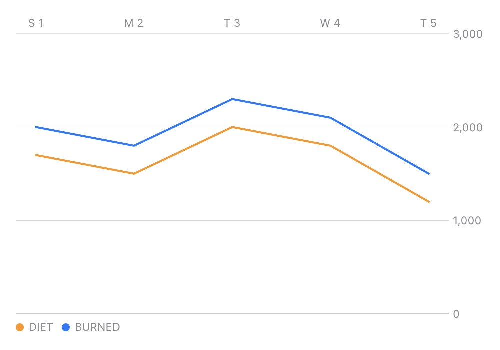
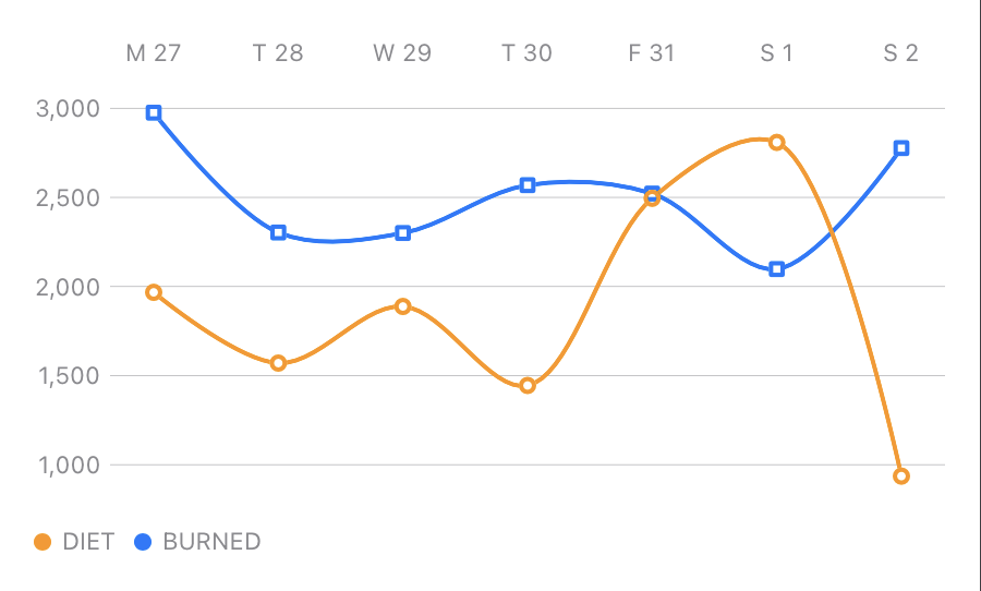
Now, with Swift Charts we can make that a reality in our apps more accessible than ever. Take, for example, a basic Line Chart like the one used in CaliCalo to display a user’s Diet vs. Active calorie count over seven days.
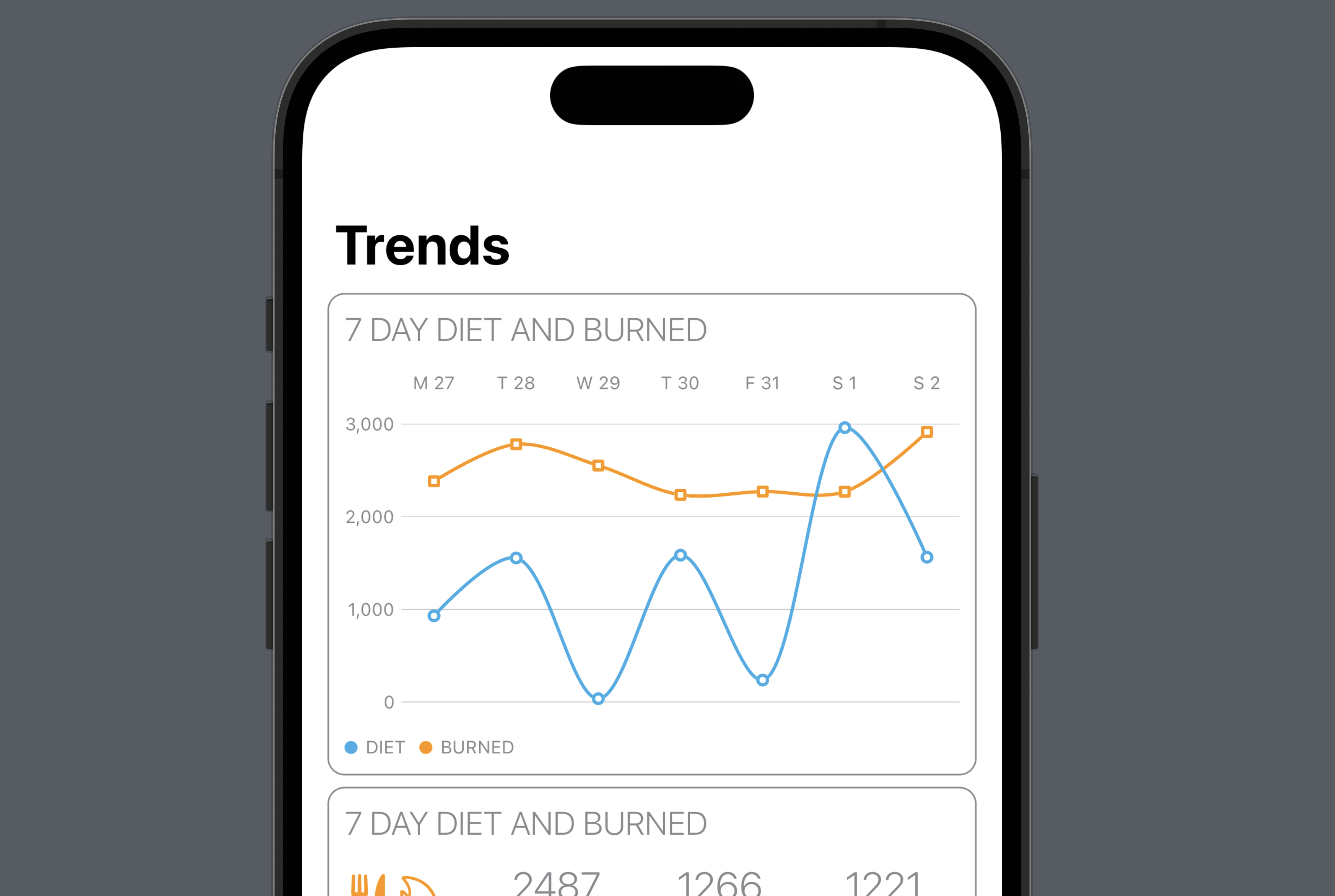
With this screen, we want to communicate essential but pivotal data quickly. How have you been balancing your NET calories (calories consumed vs. calories burned) for the last seven days? We plot two lines - one for calories consumed (diet) and one for calories burned by daily totals.
By quickly scanning the graph, users can see how their lines overlap. Depending on their goals, this can help inform progress.
- For a user trying to maintain weight, the goal may be to have the lines match up as closely as possible.
- A user trying to lose weight would be trying to consistently keep the ‘Diet’ line below the ‘Burned’ line. Opposite for the user trying to gain weight.
For either user, the line graph can help identify significant disparities or inconsistencies that can help guide behavior or tracking.
Swift Charts
Apple’s Swift Charts library offers a quick and easy way to start plotting data. We’ll use this library, along with SwiftUI, to build out our Trends chart.
Brief Overview
A quick explainer of Swift Charts in the world of SwiftUI. You have a Chart view that takes a body that should be a list of ‘marks.’ Marks can be things like BarMark, LineMark, or PointMark that plot out the data depending on the type of chart you’re making.
Add to this Chart (and its marks) some modifier functions that allow us to declare how our data dimensions are displayed & styled, and we have a pretty chart showing data at a glance.
Make a Mark
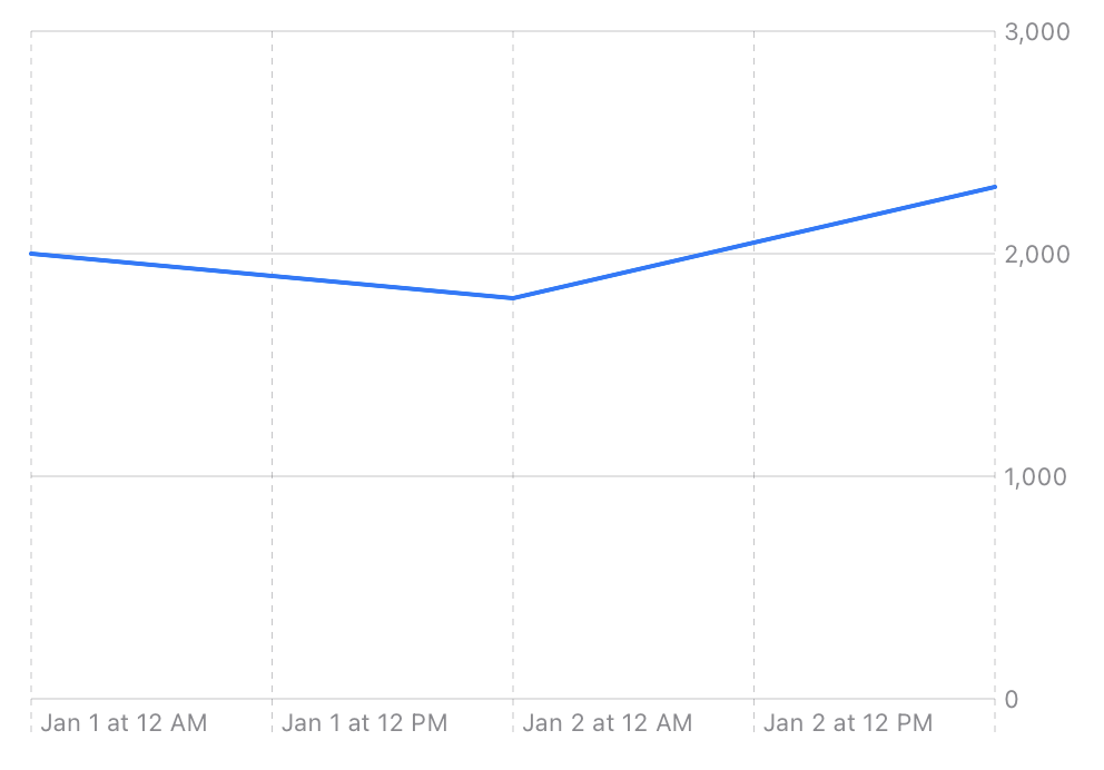
Let’s look at a straightforward example. Here, we’re charting calories per day using some brute force. Let’s create a Chart with some LineMarks.
import SwiftUI
import Charts

struct SimpleLineChartView: View {
    var body: some View {
        VStack {
            Chart {
                LineMark(
                    x: .value("Day", Calendar.current.date(from: .init(year: 2023, month: 1, day: 1)) ?? Date()),
                    y: .value("Calories", 2000.0)
                )
                LineMark(
                    x: .value("Day", Calendar.current.date(from: .init(year: 2023, month: 1, day: 2)) ?? Date()),
                    y: .value("Calories", 1800.0)
                )
                LineMark(
                    x: .value("Day", Calendar.current.date(from: .init(year: 2023, month: 1, day: 3)) ?? Date()),
                    y: .value("Calories", 2300.0)
                )
            }
        }
    }
}
The code above results in a simple, practical-looking chart that plots our 3 points on a line.
Cool to see some data visualized! Let’s look at a slightly more complicated example, where we map two lines. This time, we’re plotting the two types of calories we care about in CaliCalo - Diet and Burned. To do this, we need to plot 2 points for every day.
If we were to add a bunch of points (manually like in our example above or by looping over some data), we’d end up with a chart that looks something like what you see below—one long continuous line on the chart zigging back and forth.
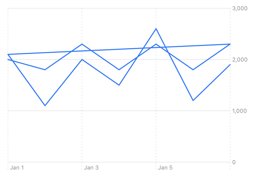
Technically, all the data has been charted, but visually we aren’t differentiating between the type of data supplied to the Chart. I think we should do that next.
Add a Modifier
Swift Charts uses modifier functions to add dimensions to how the data is displayed. It can help separate data sets and display them using different colors/shapes/curves etc. The first one we’ll utilize is foregroundStyle(by:), which we can use to change how we display our data set.
Let’s do a little prep first to make our Chart function a bit easier to read (and make it a more realistic example).
First, let’s create some structs to represent data points for our calorie data.
struct Diet {
    let dateLabel: String = "Day"
    let date: Date
    let valueLabel: String = "Diet"
    let value: Double
}

struct Burned {
    let dateLabel: String = "Day"
    let date: Date
    let valueLabel: String = "Burned"
    let value: Double
}
Then, let’s create some test data. We’ll create a list of Diet objects we can use to populate the chart for a 5-day period.
let diet: [Diet] = [
    Diet(
        date: Calendar.current.date(
            from: .init(
                year: 2023,
                month: 1,
                day: 1
            )
        ) ?? Date(),
        value: 2000.0
    ),
    Diet(
        date: Calendar.current.date(
            from: .init(
                year: 2023,
                month: 1,
                day: 2
            )
        ) ?? Date(),
        value: 1800.0
    ),
    Diet(
        date: Calendar.current.date(
            from: .init(
                year: 2023,
                month: 1,
                day: 3
            )
        ) ?? Date(),
        value: 2300.0
    ),
    Diet(
        date: Calendar.current.date(
            from: .init(
                year: 2023,
                month: 1,
                day: 4
            )
        ) ?? Date(),
        value: 2100.0
    ),
    Diet(
        date: Calendar.current.date(
            from: .init(
                year: 2023,
                month: 1,
                day: 5
            )
        ) ?? Date(),
        value: 1500.0
    ),
]
In the following snippet, we’ll use this same list twice to map two lines, but in a real example, we would have two separate lists of test data that we would chart in the next step.
Using this list of data, we can now chart two lines. We’ll use the foregroundStyle(by:) function to define each LineMark’s style for each item in the list. It’s a way of indicating how to display a given mark.
struct SimpleLineChartView: View {
    var body: some View {
        VStack {
            Chart {
                ForEach(diet, id: \.date){ dataPoint in
                    // 'Burned' Calorie data, from our list of `Diet` objects
                    LineMark(x: .value(dataPoint.dateLabel, dataPoint.date), y: .value(dataPoint.valueLabel, dataPoint.value))
                        .foregroundStyle(by: .value("BURNED", "BURNED"))
                    // 'Diet' Calorie data, also from our list of `Diet` objects, but shifted by -300 calories
                    LineMark(x: .value(dataPoint.dateLabel, dataPoint.date), y: .value(dataPoint.valueLabel, (dataPoint.value - 300.0)))
                        .foregroundStyle(by: .value("DIET", "DIET"))
                }
            }
        }
    }
}
We’ll get a chart that looks like this without any extra setup.
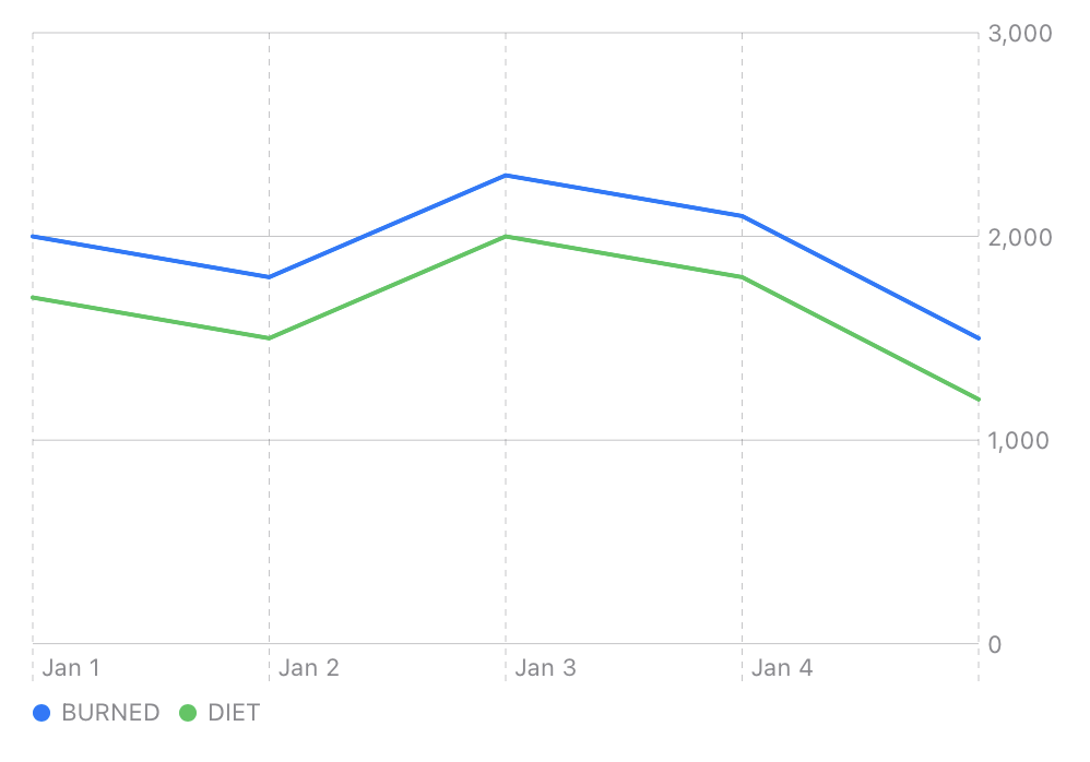
A line chart with two lines of five points each (using our diet array x2). We even have a cute little legend at the bottom left indicating what the lines mean by color.
Add some Style
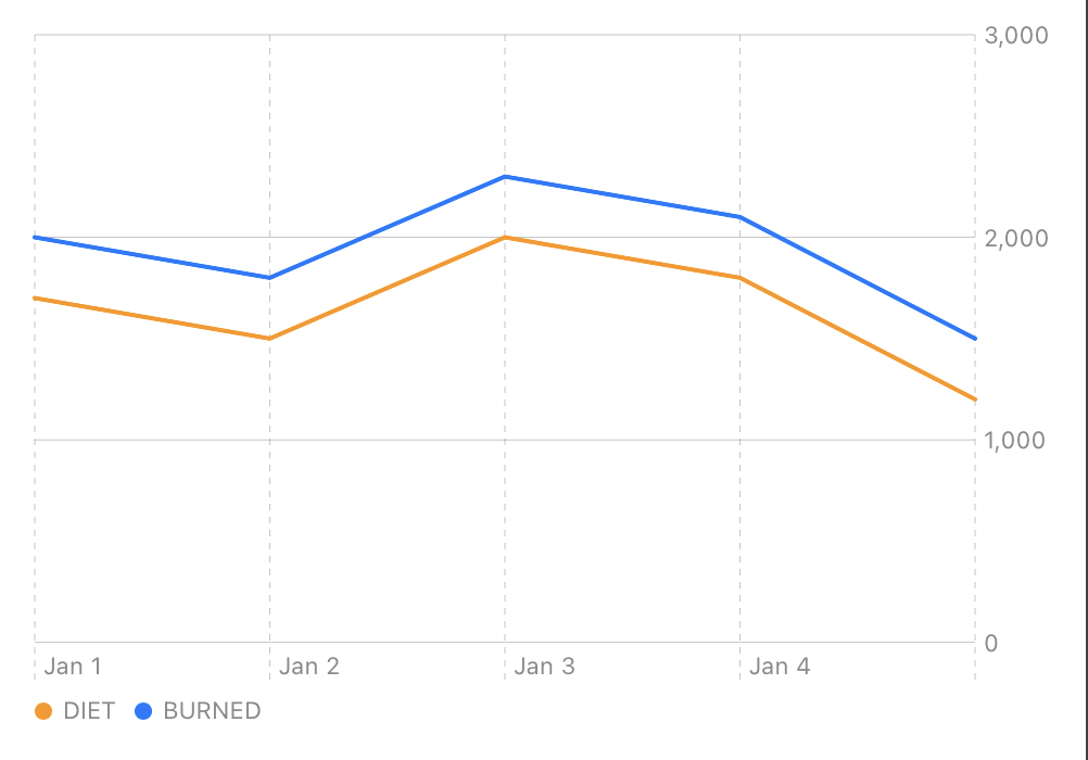
Green and blue are just the API’s default colors without us doing any extra work. If we want to add some of our special branding sauce, we use another simple modifier. On the Chart, we can apply the .chartForegroundStyleScale(_:) modifier to define the colors we want to use for each of our data sets.
Chart {
    /// ...
}
.chartForegroundStyleScale(["DIET": Color.orange, "BURNED": Color.blue])
With only that 1 line, we’ve got some nice CaliCalo colors:
Modifiers by Example
Now that we understand some of the basic building blocks of Swift Charts let’s look at a few more ways to modify our chart style. Ultimately, we should have a chart that looks close to what we’ve built for CaliCalo.
Chart Modifiers
These modifiers are applied to the Chart view.
| Modifier | Description | Example |
|---|---|---|
.chartXScale(range:) |
Add 20 pts. of padding to the X axis. | 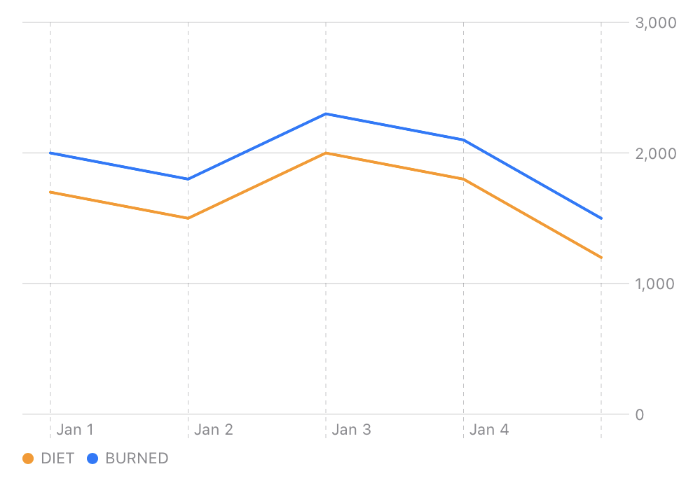 |
.chartXAxis(content:) |
Use AxisMarks to remove Y axis lines. |
 |
.chartPlotStyle(content:) |
Set the height of the chart contents within the Chart view. | 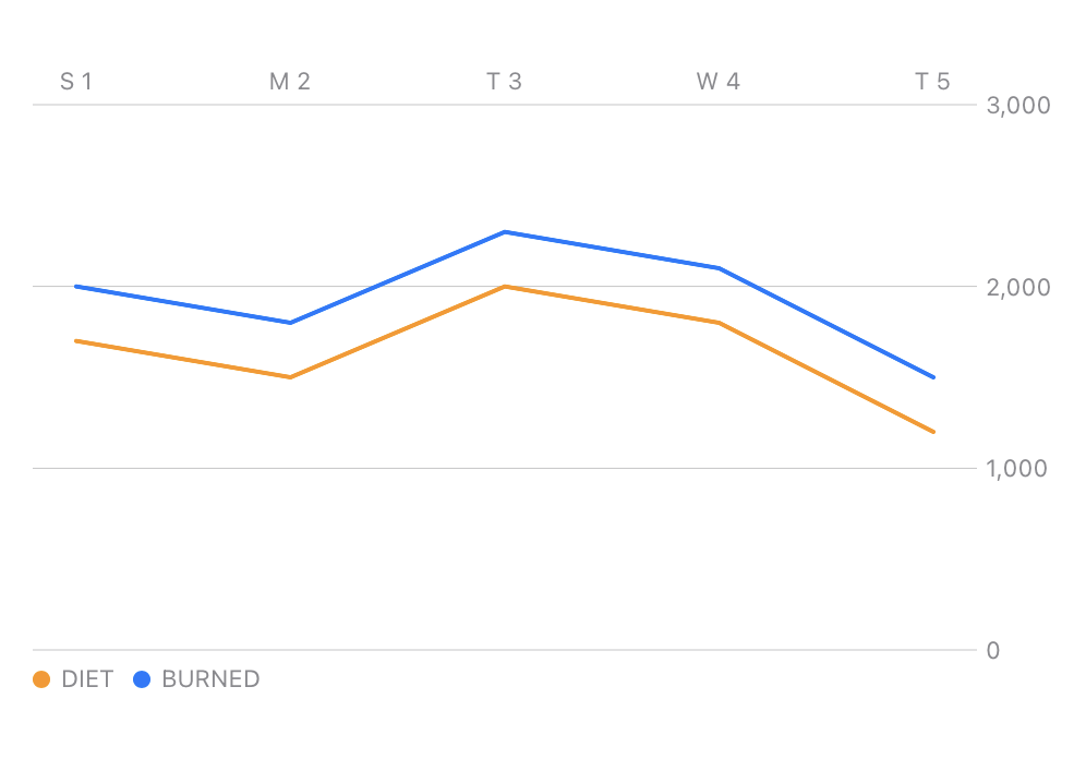 |
.chartYAxis(content:) |
Move Y Axis labels to leading edge. | 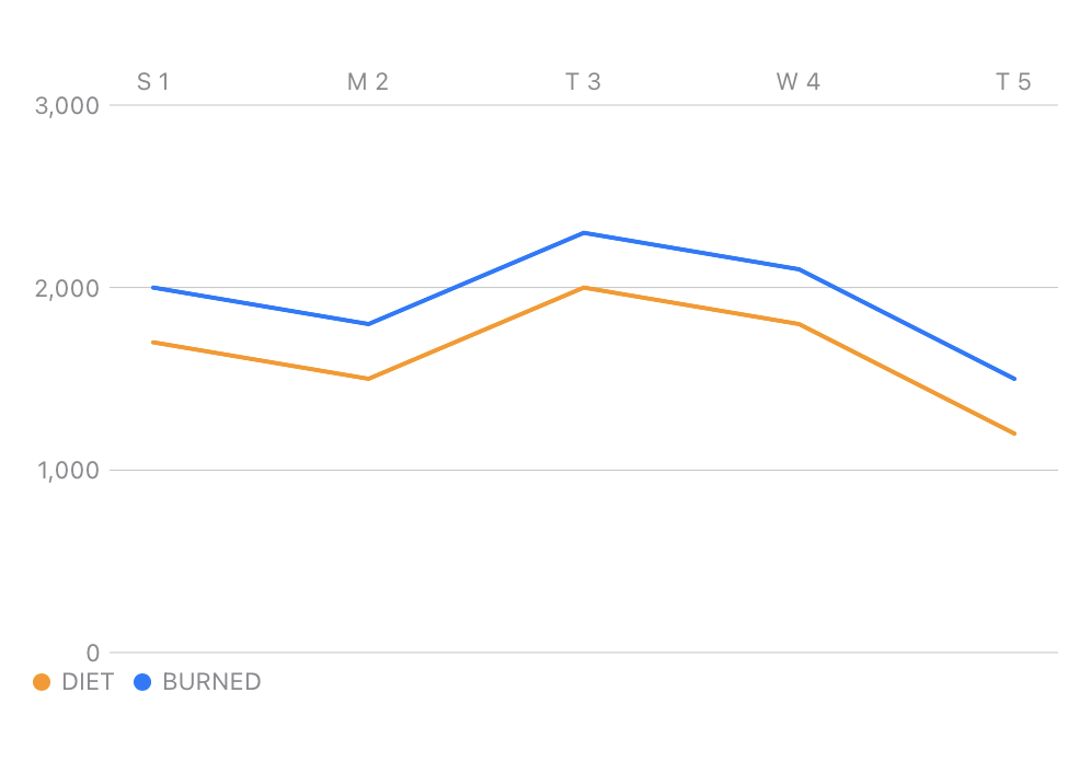 |
LineMarks Modifiers
We can apply some additional modifiers to the LineMarks to improve the overall look and feel of our Chart lines.
| Modifier | Description | Example |
|---|---|---|
.interpolationMethod(_:) |
Set .catmullRom as the interpolation method. |
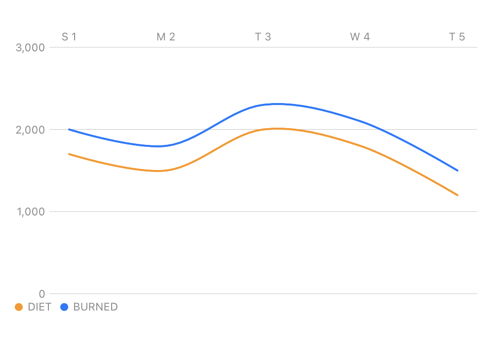 |
.symbol(_:) |
Set .square and .circle as the line mark symbols. |
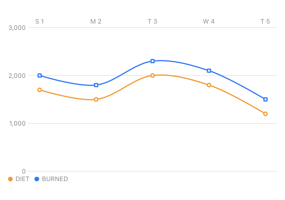 |
Modifiers Combined
Here’s how those modifiers are provided to the Chart and Marks to make the last chart example.
//...
Chart {
    ForEach(diet, id: \.date){ dataPoint in
        LineMark(x: .value(dataPoint.dateLabel, dataPoint.date), y: .value(dataPoint.valueLabel, dataPoint.value))
            .foregroundStyle(by: .value("BURNED", "BURNED"))
            .interpolationMethod(.catmullRom)
            .symbol(.square)
        LineMark(x: .value(dataPoint.dateLabel, dataPoint.date), y: .value(dataPoint.valueLabel, (dataPoint.value - 300.0)))
            .foregroundStyle(by: .value("DIET", "DIET"))
            .interpolationMethod(.catmullRom)
            .symbol(.circle)
    }
}
.chartForegroundStyleScale(["DIET": Color.orange, "BURNED": Color.blue])
.chartXScale(range: .plotDimension(padding: 20.0))
.chartXAxis{
    AxisMarks(preset: .aligned, position: .top, values: .stride(by: .day)){ value in
        AxisValueLabel(format: .dateTime.day().weekday(.narrow))
    }
}
.chartPlotStyle{plotArea in
    plotArea.frame(maxWidth: .infinity, minHeight: 250.0, maxHeight: 250.0)
}
.chartYAxis{
    AxisMarks(position: .leading)
}
//...
Wrapping Up 🎁
Combined, we can design a chart that closely mirrors our CaliCalo Trends UI.
| Our Example | Trends UI |
|---|---|
|
 |
We also learned about the basic building blocks of Swift Charts and how easily modifiers can be applied to make Charts our own.
For the complete source of this example, plus a more complex example that includes some randomized test-data-generation, check out our Trends Chart Repo on GitHub.
🐘 If you liked this article and want more tech content (and other nerd commentary) you can follow me on Mastodon. I hang out at AndroidDev.social @aj.